

Since the dawn of alphabets, hand lettering has found its use among scribes, writers, travelers etc. A closer look into a world of hand lettering reveals that it is not only writing alphabets but drawing them. Every letter serves as an illustration and is regarded as an art form.
Each piece of hand lettering is distinctive and created especially for a project. Depending on the project and the letterer, hand lettering can give any type of design—from wedding invitations to company logos—a unique, hand-crafted feel.
People frequently mix up the terms calligraphy and hand lettering. Letters are used in visual arts such as calligraphy and hand lettering. However, the way the letters are created is their main difference. The letters are primarily drawn and illustrated when using hand lettering. However, calligraphy is the art of creating beautiful writing.
While starting our hand lettering journey, we generally seek out to buy hand lettering pens and jump into the art form. But is it the right approach? If you want to become a skilled hand letterer, then you need to understand certain factors such as the materials to be used and the style to be practiced.
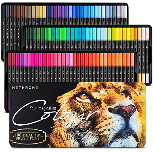
While starting your hand lettering journey, you will have to buy hand lettering pens, micron pens, pencils, koi brush pens and paper (any paper will do).
Once you have the essentials, you need to understand which style of hand lettering to start with. The most famous styles include:
Normal Block Hand Lettering: The primary lettering design that shapes most other lettering drawing techniques is probably block lettering. The process of creating block lettering is simple and shows how to make thin line text appear thicker, giving it a block letter appearance. A great way to get started with lettering is to learn how to create block letters by hand.
Serif Hand Lettering: Serif is a different kind of block lettering adaptation, and this time there are two things to keep in mind. The first is the strokes; every upward stroke is thin, and every downward stroke is thick. Additionally, all horizontal strokes will be thin as well, leaving only thick down strokes.
Brush Lettering: Since brush lettering also adheres to the rule of the thin upstroke and thick down stroke, it is a great alternative to serif lettering. Thin upstrokes and thick down strokes are used in brush lettering similarly to serif, but there are a few fundamental calligraphy strokes to learn that will improve your brush lettering.
Faux Calligraphy: It is a smooth transition to go from brush lettering to another calligraphy-styled text, like faux calligraphy. You can assemble the letters in the calligraphy-styled text using a new lettering style now that you are familiar with the strokes that make up each letter.
Once you have decided which style to start with, don’t forget to buy hand lettering pens that provide both flexibility and finesse.